
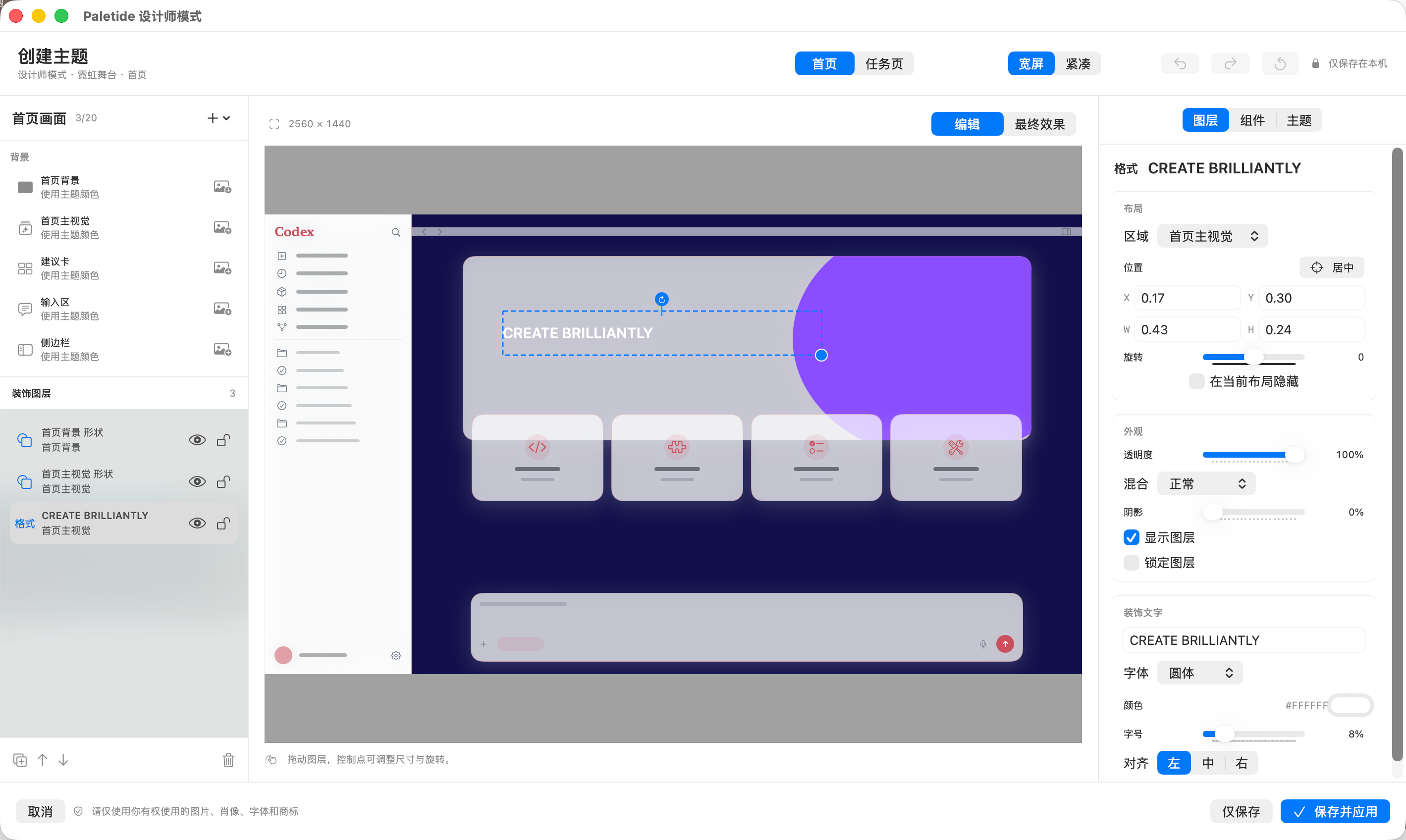
Changing a background can make a desktop workspace feel more personal. Designing a complete theme requires more control: where the hero artwork sits, how decorative text overlaps it, what material the cards use, and how the composition survives a narrow window. Designer Mode, introduced in Paletide 2.0, brings those decisions into one visual editor and turns Codex and ChatGPT desktop theming from choosing a preset into building a composition of your own.
Standard themes remain the default Paletide workflow. You can still choose a bundled theme or import a background when you want a quick change. When you need finer control, create a Designer copy from a standard theme or begin with a dedicated Designer template. The new workflow adds creative range without making basic theme switching more complicated.
Paletide is an independent third-party macOS tool and is not an official OpenAI product. It does not rewrite native Codex or ChatGPT navigation, suggestion-card content, icons, input behavior, or the macOS title bar. Make sure you have the right to use every image, likeness, typeface, and trademark in your design.
How Designer Mode differs from a standard custom theme
A standard custom theme is ideal for a fast choose-image, set-focus, and tune-color workflow. Designer Mode is built around composition and layers. Images, decorative text, and basic shapes become independent objects with their own placement and stacking order. You can assemble a poster, neon stage, paper collage, or an original visual direction without writing CSS or opening Terminal.
The editor includes both Edit and Final Result views. Edit mode exposes selections and handles; Final Result mode shows a cleaner representation of the applied composition. The editing canvas, final preview, and saved theme share the same cover / contain projection behavior, reducing the chance that a layer will unexpectedly change size, move, or overflow when the theme is applied.
Four starting templates, from guided composition to a blank canvas
Paletide 2.0 provides four Designer entry points. Each template supplies a composition framework only; it does not include a person or third-party artwork. Replace its placeholders with material you are authorized to use.
| Template | Best suited to | A practical starting point |
|---|---|---|
| Portrait Poster | Portraits, character-led visuals, and bold titles | Pair a transparent subject with a headline and generous negative space |
| Neon Stage | Technology, gaming, and evening workspaces | Build a focal point with saturated light, glow, and stage-like framing |
| Paper Journal | Muted paper, collage, and handcrafted styles | Combine paper backgrounds, outlined shapes, and restrained decorative text |
| Blank Canvas | Users who already have a clear visual direction | Start without preset layers and decide every region, asset, and hierarchy yourself |
Templates are starting points rather than locked designs. A Portrait Poster can become a product cover, while Paper Journal can become a quiet coding workspace. Their purpose is to remove the initial friction of an empty canvas while leaving the composition editable.
Images, decorative text, and shapes become editable layers
Designer Mode supports three core layer types: images, decorative text, and basic shapes. Select a layer to move, resize, rotate, or crop it, and adjust properties such as opacity and shadow. Image layers can be zoomed directly with the scroll wheel. A continuous scroll is grouped into one undoable action, which keeps fine adjustments from flooding the edit history.
The layer list manages the structure of the design. You can reorder, duplicate, hide, lock, or delete layers, while snapping helps maintain alignment. Position, width, height, and rotation are also available as precise inspector values. Decorative text has controls for content, color, size, and alignment. Basic shapes expose fill, stroke, and line width. Text uses a limited set of fonts supplied by Paletide; importing a custom font is not supported in this release.
The home view is more than one full-window background. Designer Mode can assign independent backgrounds or layers to these regions:
- Home background and home hero
- Suggestion cards, composer, and sidebar
- Home header decoration and composer corner decal
This region-based model helps the design work with the actual interface. The hero can establish the visual identity, suggestion cards can preserve stronger contrast, and a small transparent asset can sit in a header or composer decoration slot. Those elements no longer have to be flattened into one large image before import.
Design the home view, task view, wide layout, and compact layout
A theme that works only in a maximized window is not finished. Paletide 2.0 clearly separates the Home and Task views, while the home composition can be tuned independently for Wide and Compact layouts.
The same home layer can store different placement, size, and crop values for wide and compact windows. When the window narrows, the subject does not have to be squeezed out of proportion and a headline does not have to fall beyond the image. New templates begin with layouts that avoid common cover-crop danger zones, but it is still worth checking the relationship among the hero, suggestion cards, and composer in both variants.
The task view favors long-form readability and therefore uses a quieter, static background. Its artwork has independent controls for focus, zoom, opacity, brightness, saturation, blur, and scrim. The home view can carry more personality, while the task view keeps conversations, code, and the composer legible. Designing them separately produces a more durable result than covering every context with the same high-intensity decoration.
A clear workflow from template to applied theme
For a first Designer Mode project, use this sequence:
- Choose Portrait Poster, Neon Stage, Paper Journal, or Blank Canvas, or create a Designer copy from a standard theme.
- Establish the home background, hero artwork, and overall palette before adding image, decorative-text, and shape layers.
- Arrange layers with canvas dragging, handles, and inspector values; use duplicate, reorder, hide, and lock to keep the composition manageable.
- Switch between Wide and Compact, checking that important artwork stays away from crop edges and does not obscure native content.
- Move to the Task view, choose a restrained background, and test the readability of long text, code, and the composer.
- Review the Final Result, then choose Save Only or Save and Apply.
Save Only adds the theme to the local library without applying it, which is useful for keeping a draft. Save and Apply stores the theme and then activates it. Saved Designer themes can be edited, copied, or deleted later. If saving succeeds but applying fails, the editor retains the saved theme so you can inspect and retry without creating another copy.
Theme assets and compositions stay on the Mac
Editable layers, content-hashed assets, and composition output are stored on the current Mac. The save process performs full validation and uses temporary directories plus atomic replacement to reduce the risk of a failed operation damaging the existing theme. Images are checked by their actual content for format, file size, dimensions, and decoding integrity. PNG, JPEG, and WebP are content-detected, while HEIC and TIFF enter a controlled conversion path.
Local storage does not grant usage rights to an asset. Portraits, brand marks, fonts, and illustrations should still be your own work or material covered by an appropriate license. Decorative layers do not intercept interface clicks and are hidden from the accessibility tree. Related effects are paused or cleaned up during window resizing, background-page transitions, Reduce Motion, theme pause, and restore operations.
Current boundaries of the first 2.0 release
Designer Mode is intended to produce a validated, continuously editable theme composition, not to inject arbitrary web code into a desktop app. The runtime does not accept arbitrary CSS, HTML, JavaScript, SVG, GIF, video, remote URLs, or custom fonts, and it does not alter native Codex functionality.
There are three important limitations in the initial release:
- There is no automatic background removal. Prepare an already cut-out transparent PNG or WebP for portrait and object overlays.
- There is no theme-pack sharing or one-click export for other users. Designer themes currently focus on local creation and use.
- There is no custom font import. Decorative text uses the limited font choices provided by the product.
These boundaries keep the output verifiable and recoverable while preventing decoration from interfering with native interactions. Standard themes remain a strong choice for anyone who wants a quick visual refresh. Paletide 2.0 Designer Mode is the main step forward for users who care about composition, identity, and responsive layouts across different window sizes.
Visit the Paletide product page to explore Designer Mode, then see license options or read the installation guide. Paletide currently supports macOS only; a Windows version is still in development.